
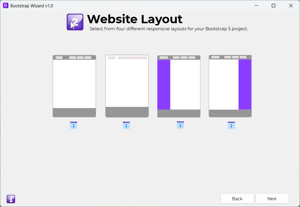
The Website Layout screen helps you select from four different responsive layouts for your Bootstrap 5 project. All layouts are responsive and display properly on all sizes of screens.
Layout 1
A single column layout with a dark header with a logo and a responsive menu that collapses down to a hamburger menu, with a footer.
Layout 2
A single column layout with a white header with a logo and a responsive menu that collapses down to a hamburger menu, with a footer.
Layout 3
A two-column layout with the sidebar to the left hand side and the primary content area to the right. It has a dark header with a logo and a responsive menu that collapses down to a hamburger menu with a footer.
Layout 4
A two-column layout with the sidebar to the right hand side and the primary content area to the left. It has a dark header with a logo and a responsive menu that collapses down to a hamburger menu with a footer.
Back to Home